Brief

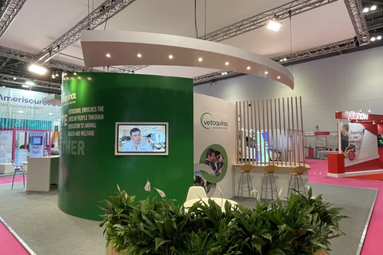
We were asked by Vetoquinol to create an 11m x 9m exhibition stand for the London Vet Show exhibition. They wanted the stand to be clean, fresh and inviting, with a keen focus on sustainability. The stand would ideally have a number of zones that could be separated organically.


“We designed and built a stand using curves and scythe-like shapes to define areas within the space”.


What We Did

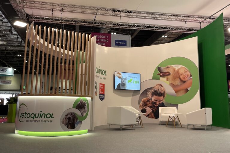
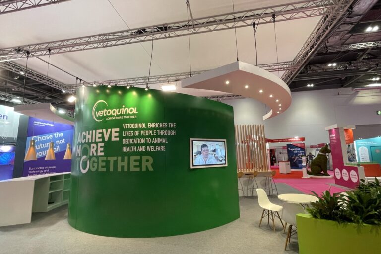
We designed and built a stand using curves and scythe-like shapes to define areas within the space. This helped create a seamless flow around the stand. The stand itself would include a welcome desk, numerous seating options and a bar area all within the space.

Vetoquinol Exhibition Stand display

Vetoquinol Exhibition Stand

A FUNCTIONAL SPACE

Main Walls

The main walls within the space were an inner and outer curve. These would subsequently be the foundation of the entire space of which the welcome desk and bar area would wrap around. As well as being visually pleasing they were also functional as they created a space in which our clients could lock away items between the two structures.

Vetoquinol Exhibition Stand front desk

ORGANIC SHAPES

Welcome Desk

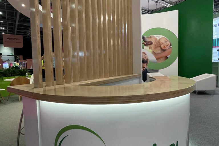
The welcome desk, which sits in one corner of the stand is made up of a low wall unit with self-supporting vertical lacquered birch ply pillars and a curved desk structure which is sat to the front. The curved desk is completed by recessed LED lighting, rear shelving and Vetoquinol graphics, including their strapline. This area also include additional bar seating behind the birch ply pillars.

Vetoquinol Exhibition Stand

SCYTHE SHAPE

Bar Area

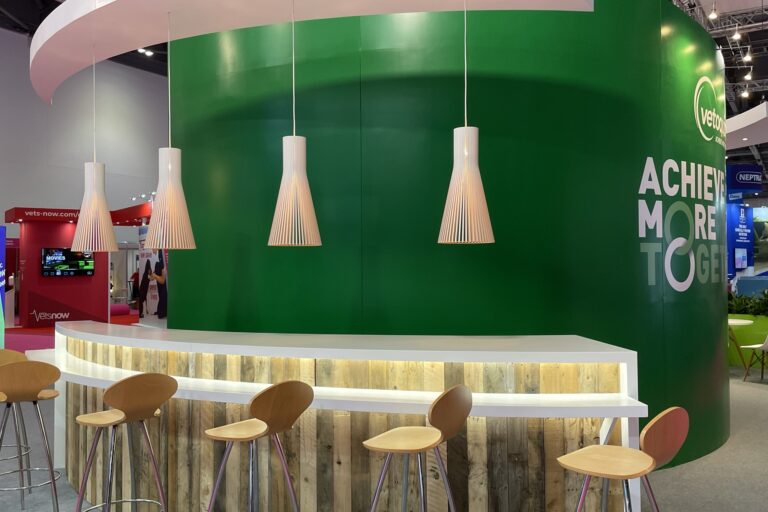
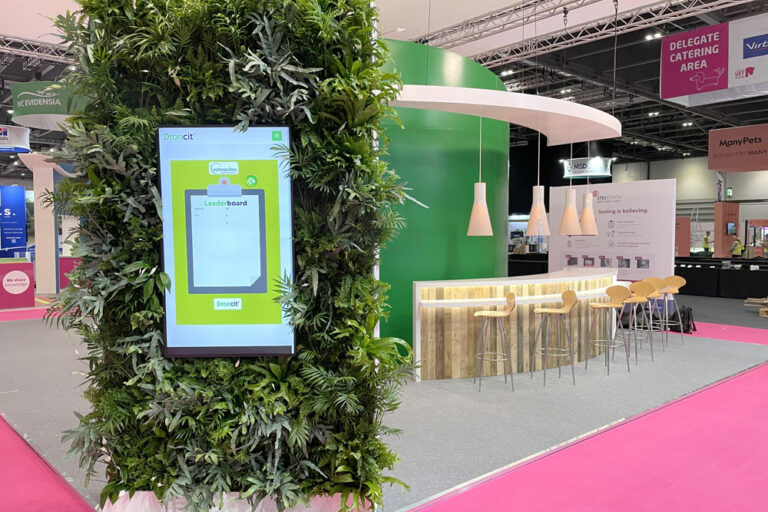
The bar area included a scythe shaped bar unit clad in pallet timber with a spray lacquered top and recessed LED lighting. The unit also included shelves to the rear as well as a void for a refrigerator unit for the caterers to use. Above the bar the scythe shape was reflected with a ceiling panel which housed four low hung pendants.

Vetoquinol Exhibition Stand

CHANGING LEVELS

Rear Seating

The rear seating area was brought down to a lower level with the area being defined by a curved planter that wrapped itself around the seating area. Above this area was a scythe ceiling panel with inbuilt spotlights further carrying through the look of the stand.

Vetoquinol Exhibition Stand seating area

FOLIAGE TO SOFTEN

Green Totem

One corner of the exhibition stand was home to a living corner totem unit complete with video screen incorporated on the external side. The unit was spray all over and included an internal structure to support the planting.


Challenges

As with many jobs this one had a fair few challenges, but you can’t begin a design process worried about practicality or you’ll always be restricted to your ideas.

The design we produced had massive curved walls that have a compound curved top – meaning they curve in two directions. A design choice which is extremely hard to achieve, particularly on this scale. The enormous walls also needed to be finished to exhibition grade standard including joints, graphics and fixings. Something that requires careful consideration throughout.

Due to the ethical nature of the client all plants are real – not artificial. So we needed to keep them alive in transit, during fit-up and during the show.

And the final challenge was that the whole thing needed the ability to be dismantled and rebuilt for it to be used again, whilst ensuring that exhibition grade standard was still met.